Recently we watched the latest Christopher Nolan movie, Interstellar. Quite a thought-provoker, and some of it a little beyond my mental grasp, the film deeply inspired me with its otherwordly scenes.
One that stood out to me in particular, was near the end where the main character seems to have entered a fourth/fifth timeless dimension, and is attempting to communicate by gravity to his daughter who is in actual earth time. He finds himself behind an infinite replication of his daughter's bookshelf, and uses the books to send her messages that will impact future human civilisation.
I just had to draw this, it was such a fascinating scene, especially as he sees her on the other side, distressed and confused at how things has turned out (I'm trying not give too many spoilers!), yet he cannot make himself heard to her.
Do you think the spaceman looks like Matthew McConaughey? As distinctive as his features are in all the photos I could find, I spent a lot of time erasing and tweaking, and still it did not seem to quite match! Let me know what you think.
I will be framing this piece shortly, and post a photo of it in its final "housing" here soon!
Tuesday, 16 December 2014
Sunday, 10 August 2014
Portrait doodle...
I somewhat sneakily saved a friend's photo off Facebook, for a rainy day when my fingers itched to draw something doodlish and I had the time...
So, the rainy day came, and I sketched out the features in pencil, dabbed with the putty rubber to lighten, and traced over with brown pen. I wanted a more bold, conceptual feel to the drawing, so I used heavy contrast (ie. a large dark area with no detail, and then a very "lit" area for the focus point). Then I thought some colours would spice it up nicely, which I think did the trick on her right shoulder.
What I loved about this girl's face is the purpose in her expression, something soft yet strong. But most of all - the hair! You've got to love such naturally expressive hair... :-) So cool...
Wednesday, 6 August 2014
Delving into Myths...
Recently, I noticed an exciting art competition being held by Tiny Pencil (#DrawAThon), and after thinking about it far too much, decided to give it a try.
So the brief being based on Cornish folklore, I found myself attempting a more surreal type of subject to what I am used to - it was pretty awesome! The submission had to be completed in graphite alone (which suited me very well!).
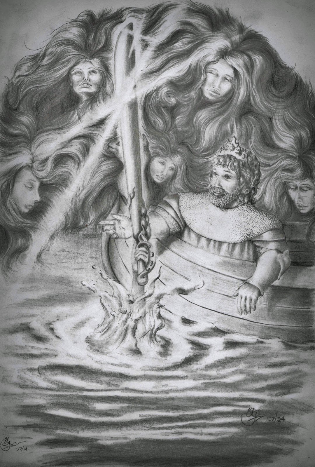
It never occurred to me to document the progress for you, but here be the finished work below:
 |
| King Arthur's lucky day! |
As you can see, I chose the old tale of beloved King Arthur receiving his enchanted sword from the Lady in the Lake. I imagined it to have been a breath-taking moment, like a time long-awaited by the Lake spirits (not that I believe any of it for a second, mind!). It isn't clear exactly which culture these tales originated from, but Tintagel Castle in Cornwall is said to be Arthur's birthplace, so that makes it Cornish enough for me.
I enjoyed playing with contrasts and lighting, as these are two strong manipulating elements in grayscale art. I still feel I could have increased the darkness around the outside of the drawing, to enhance the sense of light emitting from the water.
Meanwhile I wait with some excitement to see how my drawing fares in the prize-winner selections - 10 draws, plus 3 special (mouth-watering) prizes for the top three starring artists. I'll let you know if there's any good news!
Meanwhile I wait with some excitement to see how my drawing fares in the prize-winner selections - 10 draws, plus 3 special (mouth-watering) prizes for the top three starring artists. I'll let you know if there's any good news!
Tuesday, 3 June 2014
En Pointe...
This painting was made for a friend's birthday, using Acrylics and charcoal. One of those pieces you just feel inspired for, and it comes together so quickly!
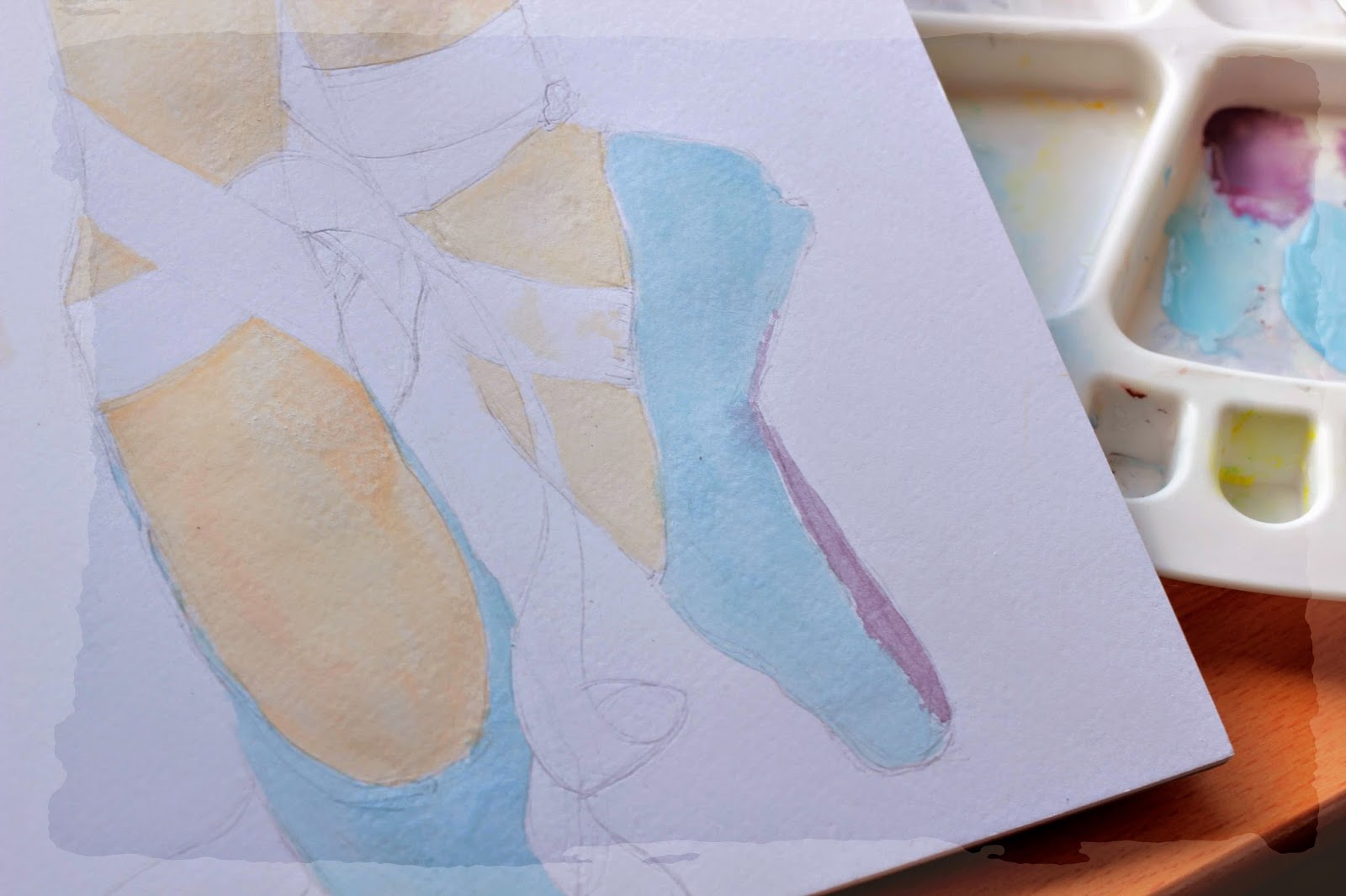 |
| As always, starting with a pencil sketch! |
 |
| Shading the ribbons |
 |
| Sometimes something pretty must come out of a bit of a mess! |
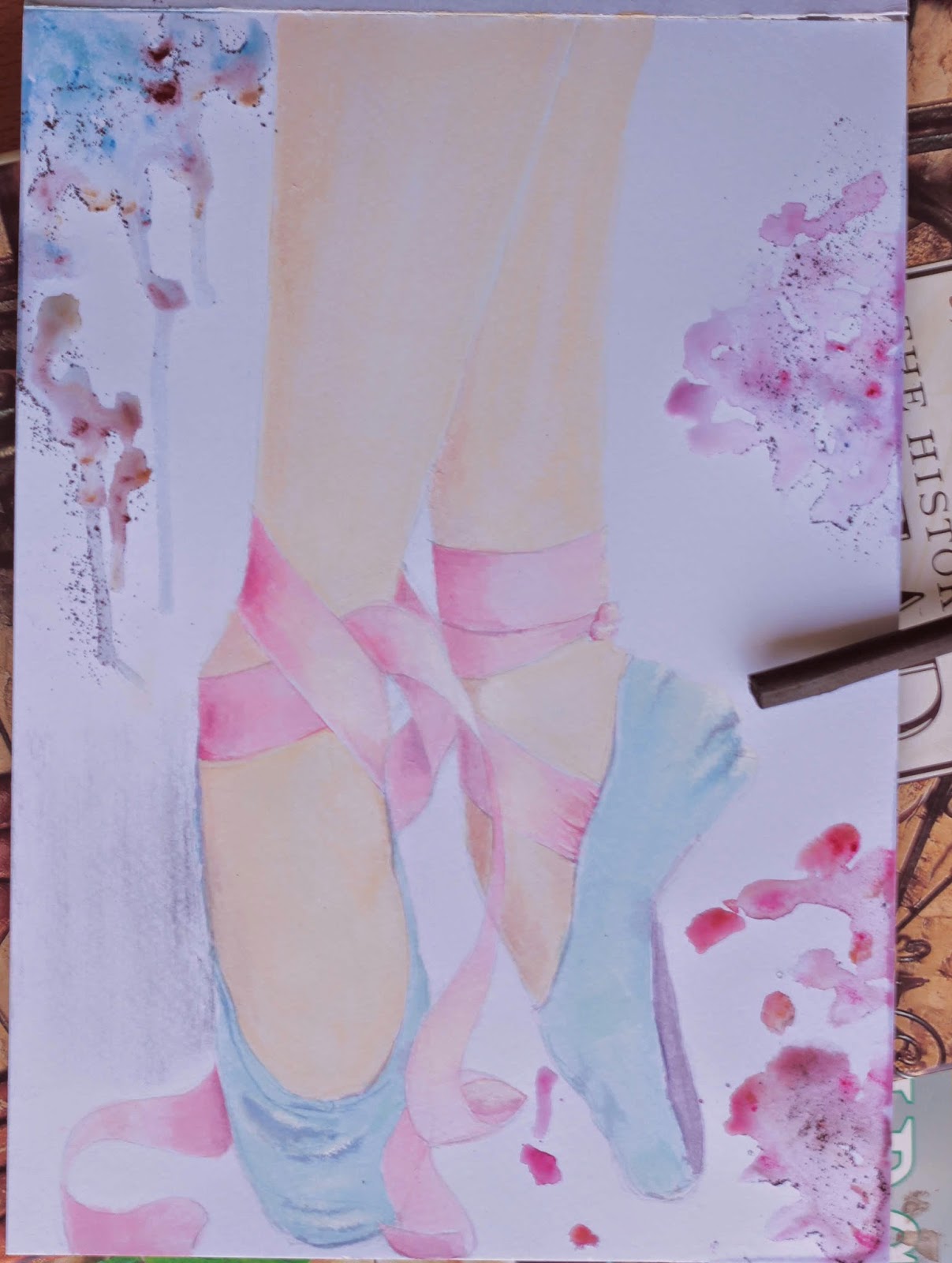 |
| decorative finishes |
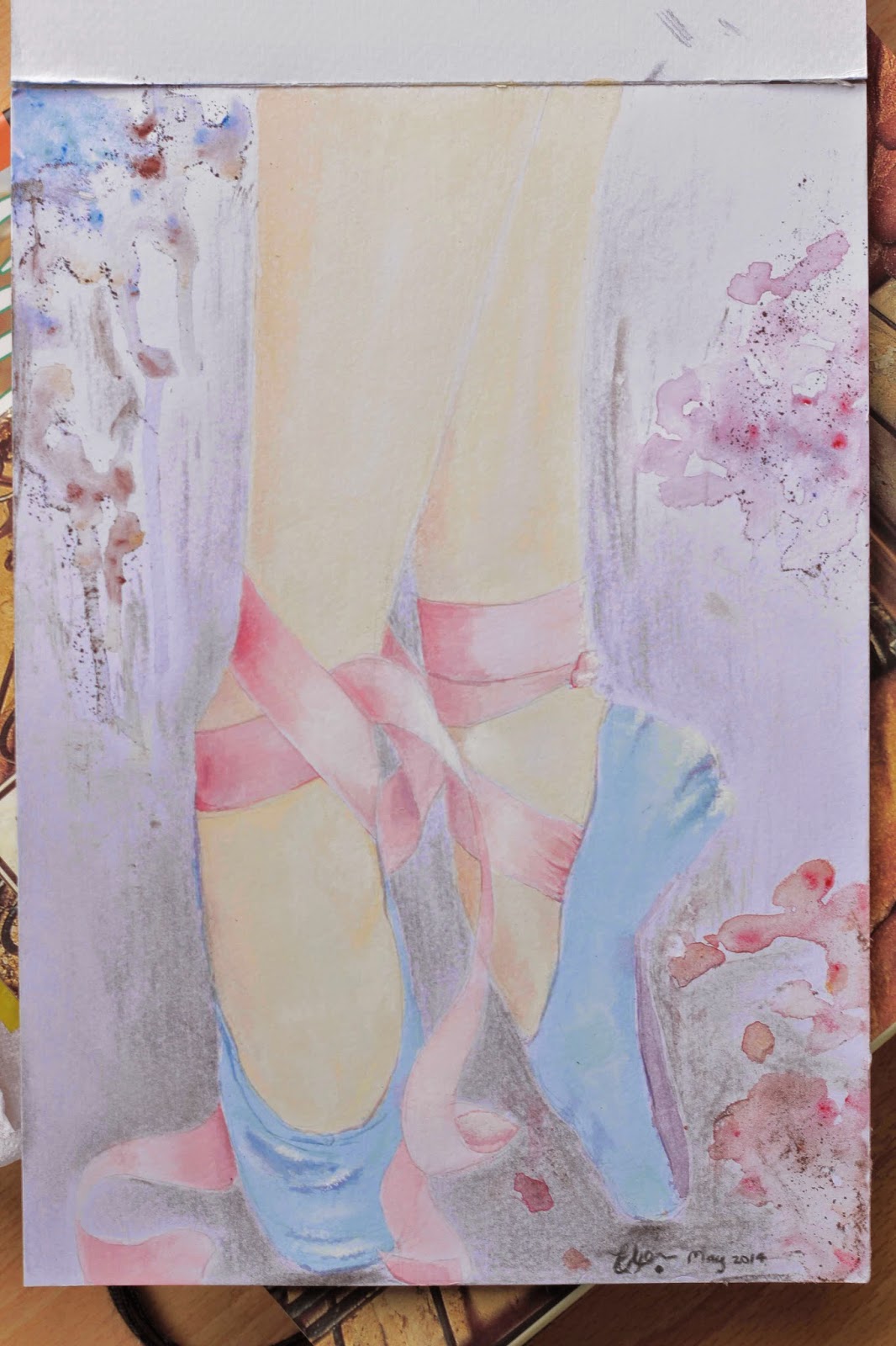 |
| All done! Charcoal shading added |
For the dust effect, I grated soft brown pastel (using my sandpaper block) onto wet paint. The mottled paint effect was done simply by applying water to the paper and adding thinned colours of choice to the wet areas, without spreading or mixing the colours together. I tilted the page to make some of the paint run down for a more striking effect.
Tuesday, 15 April 2014
Cool stuff I work with...
For the next few months (as with the past few), I will be very busy in completing illustrations commissioned for a story book. As beautiful as the drawings are turning out (if I may say so!), they are of course, sadly, not mine to share. So instead I would like to share with you some of the fabulous art materials I work with...
As far as pens go, I have found the Faber Castell Artist PITT range so delicious - a set of four, from Superfine, Fine, Medium to the thick soft Brush tip. With firm felt-tips, they are great for comic line work, quick sketching, monochrome and very detailed pointillism (to name a few!). They are also waterproof, which allows for watercolour washes over the top. I love the precision of the pens, giving very clean lines for a stark effect.
In addition to black, the range also comes in brown, which I think are superb for sepia drawings or simply a softer effect than the hard black.
 |
| I have only two of the black PITT pens in my collection! |
 |
| An example of pointillism for hair, using the Superfine Black |
In addition to black, the range also comes in brown, which I think are superb for sepia drawings or simply a softer effect than the hard black.
 |
| Brown range |
Graphite is just such a joy to work with! Recently, I bought a set of four graphite pencil sticks. In other words, they are solid graphite, shaped just like pencils, with no wood, and a thin plastic coating around the stems. This allows for wide, loose strokes as well as fine sharp lines. They have proven great for creative doodles at home, though they'd be just as lovely for facial portraits, landscapes, stills and really any study you'd like to have a go at. Great all-rounders.
 |
| The coolest graphite I've ever worked with! |
 |
| See? |
Just one word of advice: Don't visit The Deckle Edge with any large sum of money in your pocket! Or at least, I shouldn't.
Saturday, 8 March 2014
Going astray...
Well, here we have a beloved brother about to wander off across a barren rocky scape. All it takes is an observant, caring friend to reason, maybe intervene. I found this picture on the great wide web, and instantly this analogy came to mind. So I have named the drawing "Brother please, not that way".
I know. They're just ants. But ants are pretty amazing. They make you think of yourself - we who are so much more complex, equipped and capable, yet so lacking in the same urgency of life, and dedication to service and wholeheartedness. They are an example in so many ways, and testify of the Greater Being they obey.
I stand all the more in awe of these tiny creatures, having attempted drawing their exquisite bodies. There is no single object or part that is simple, all work together beautifully, and are most aesthetically pleasing. The form reminds me of some incredibly sleek sci-fi sports car, finished to a high gloss and gorgeously designed.
What amazed me further, was these two ants, contrary to casual observation, were not exactly alike. Take the abdomens for example. The one on the right has clearly defined narrow black bands, while the left-hand ant has evenly sized segments of the same colour tone. The detail is mind-blowing. What else can I say...
I know. They're just ants. But ants are pretty amazing. They make you think of yourself - we who are so much more complex, equipped and capable, yet so lacking in the same urgency of life, and dedication to service and wholeheartedness. They are an example in so many ways, and testify of the Greater Being they obey.
I stand all the more in awe of these tiny creatures, having attempted drawing their exquisite bodies. There is no single object or part that is simple, all work together beautifully, and are most aesthetically pleasing. The form reminds me of some incredibly sleek sci-fi sports car, finished to a high gloss and gorgeously designed.
 |
| The finished artwork: "Brother Please, not that Way" |
 |
| I applied a Black & White photo effect, which I rather liked |
 |
| My inspiration |
What amazed me further, was these two ants, contrary to casual observation, were not exactly alike. Take the abdomens for example. The one on the right has clearly defined narrow black bands, while the left-hand ant has evenly sized segments of the same colour tone. The detail is mind-blowing. What else can I say...
Saturday, 1 March 2014
Trigger happy...
Faces are so interesting to paint or draw. It is extremely satisfying to carefully study a photo and begin with those first tentative swoops and circles to determine the position and basic shapes of the face... and within a few hours have the person's eyes gazing at you from the paper.
In the case of this portrait, I have the benefit of knowing my subject personally. I say that is a benefit, as I feel I can slip in parts of the person's nature that I have observed, or tweak the expression very subtly to best express how I have come to know him/her. Of course, I do my best to accurately capture the picture, but always keeping in mind the character, the heart of this person as I draw.
 |
| Acrylic watercolours (starting with a light pencil sketch) |
Sunday, 12 January 2014
DOG: Drawn on the Go
Looking at this drawing now, I am once again reminded to rather use the grid method than copying by eye only! But I so badly want to get it right without such help! Surely it must be possible...
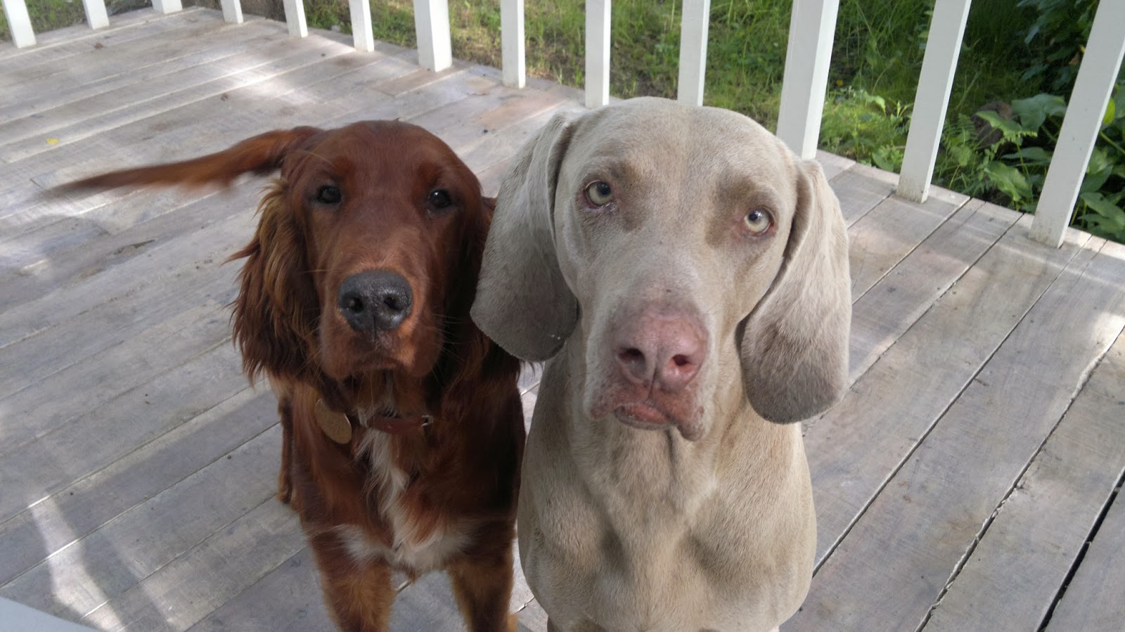
These are the sweethearts owned by my parents - two individually endearing characters. Let me introduce them thus: On the right, Baxter, the palest shade of grey from the tip of his nose the the end of his tail, capable of developing thoughts on extremely memorable occasions, and highly dependent on his masters for uplifting his ever downward emotional spiral with encouraging sweet-talk. He is the most loyal dog my parents have ever owned, and to crown it all, a purebred Weimaraner. Simon, on the left, a purebred Red Irish Setter, and of the softest silkiest pelt ever known to the canine kingdom. It to this we owe his sombre and regal demeanour, draped in many layers of nobility and wisdom (from the very hour he was born).
Sadly, Simon is no longer alive. RIP sweet Simon; you were a delight to all who knew you!
Tuesday, 31 December 2013
The people of Rohan...
I always thought I wouldn't mind being a member of that horse country in Tolkien's tales of Rohan... The horse people...
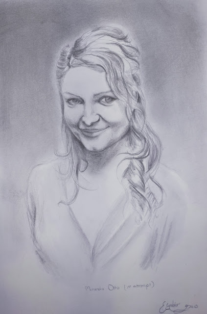
Well, here we have Eowyn - ahem, actually Miranda Otto - do forgive me! I liked the tenderness in her face in this photo, and found the design of her face so sweet. So I attempted a sketch, without a grid, and now you see what the results look like without some sort of map to aid your eye. It is strange - you compare and compare til your eyes hurt, and yet you can't figure out where the facial differences lie between your image and the photo!
One feature I can definitely pinpoint is the eye size and positioning - my copy has larger eyes, positioned a little too high.
Another artist suggested I add a background gradient, which I must agree makes the person stand out a lot better:
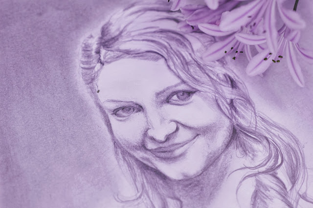 |
It is somewhat addictive, you know, copying faces... you start looking at people differently... * what a cool face to... draw* *love those wrinkles, they'd look so cool in a painting...* *such sparkly eyes... wonder how you'd get them on paper*
Thursday, 19 December 2013
Swift strokes
Lately I have been trying my hand at some linework and quick shading in black-and-white. It has been an encouraging phase for me, for as some of you will know, completing time-intensive artworks can become trying, especially when the results are disappointing!
Doing a few minute-long pieces has been quite fun therefore, simply copying any photo I fancy, without bothering about too much finesse.
 |
| Some actors from Tree of Life, graphite stick |
 |
| My husband's legs! Charcoal |
 |
| Copies of random photos in graphite |
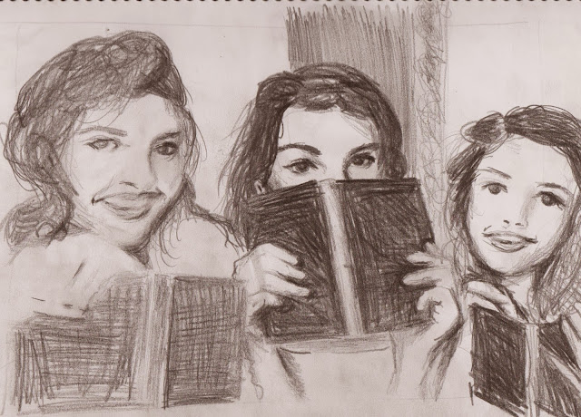 |
| Copy of the photo below, three delightfully beautiful young ladies who happen to be my friends too! |
 |
| You can see why I was inspired to draw them!! Such beauties! |
So, I believe this is improving my hand at mastering strokes with ease and drawing what I see more accurately...
Wednesday, 27 November 2013
Horses in striped pajamas...
A little friend of mine loves those fascinatingly decorated wild horses that roam our African plains. So I painted a pair for her birthday:
 |
| Watercolour acrylics |
I was copying it from a picture I found online, and only realized halfway through that the image I was referring to was actually a painting!
 |
| The original (artist uncertain) |
As always, I began with a pencil sketch, outlining the body shapes and even the stripes. If you look more closely at my painting (please don't!) you will actually see some stray graphite lines on the necks where I didn't erase enough. I could have actually spent a lot more time on shading the bodies to enhance the fine hairs and slightly off-white discolouration (they are wild beasts after all!). But this is what happens when you start preparing someone's gift on their very birthday!
The background was pretty fun, watching those gorgeous colours flow on the wet paper and swirl together all of their own accord. This is the joy of watercolours! They have a mind of their own, always an artistic flair to contribute as you paint, I daresay... I heavily wet the background around the zebras (doing so in about four sections, otherwise the water dries out before you reach all corners of the artwork). Then I selected and mixed several pretty colours, and very delicately dabbed them on the wet paper in several areas, maybe giving a flick here and there to aid mingling. The paper must be wet enough to cause the colours to start flowing spontaneously the moment they touch the paper. Tilting the page can also help intermingling. Using the brush to help mingling is not ideal as this tends to result in the colours mixing and forming more solid (and usually brown!) colours.
If you have watercolours, you might have fun just playing around on various sheets of heavy paper, making colours swirl together, and colouring in basic shapes/leaves/flowers, etc. It can be very rewarding, and it's a great way to get started, without expecting yourself to come up with some stupendous masterpiece...
Thursday, 14 November 2013
Little things...
If you have noticed a lull in my blogging, it would be due to my occupation with illustrating a friend's book. It is proving an absorbing, highly creative (and time-intensive!) learning experience, not only in art, but also history, geography and culture. I feel really blessed to have such an interesting, beautiful story for my first project!
Naturally these illustrations are not mine to share, so I have decided to give you a peek at some other gentle and little things I have drawn over time.
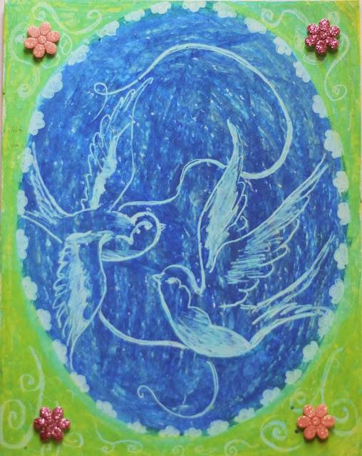 |
| A birthday card |
 |
| Copied from a photo |
 |
| Getting ready to illustrate a children's story book soon! |
 |
| A pair of old shoes - don't leather items just have their own kind of ageless beauty? |
These "small" subjects tend to be quick to draw (20 minutes to half an hour), and make great adornments to gift cards, or a starting point to get yourself drawing. Using a photo or drawing from real life is very handy, as you will be able to physically study such things as the way light falls and reflects on your subject, or what elements compose the texture, or exactly what the silhouette shape is... and so forth!
Happy drawing!
Friday, 1 November 2013
The oldendays...
Currently I'm finding delightful challenge in ink drawings, influenced by the historic line-shading technique, the type usually depicting scenes from the 18th century and earlier. Two particular favourites of mine are by Albrecht Durer:
 |
| "Watermill at the Montaco" |
 |
| "View of Arco" |
Well, they are not exactly line drawings - perhaps only pen outlines used - but here is a better example of what I am referring to:
 |
| Pierre de Fermat, great French mathematician of the 17th century |
Though I haven't exactly translated this style in the image below, I am still incorporating the technique to some degree. It is surprisingly difficult to accustom your hand to the neat flowing strokes and keeping the same width between them all the way!
 |
| Romanian gypsies |
What really captured my attention was the beauty of motherly devotion and a touch of wild independence carried in their demeanor. This is why I am not entirely happy with my rendition - it doesn't quite capture their spirit. Here is the original:
I used a bit of charcoal for the pattern of her skirt, as well as shading the darker side of the wall, just to soften the stark pen lines.
A new technique - what can I say! Learning stroke by stroke...
Friday, 18 October 2013
Effervescence!
Do you know a sparkling character, with shining eyes and fiery spirit, delightful and fascinating as a kaleidoscope in its swirling colours? I know a sweet darling much like this, and upon finding a beautiful picture of her, I stowed it away for a quieter time when I might attempt capturing that lovely smile...
Subscribe to:
Comments (Atom)


+BLOG.jpg)
