Translate

Friday, 1 November 2013

The oldendays...

Currently I'm finding delightful challenge in ink drawings, influenced by the historic line-shading technique, the type usually depicting scenes from the 18th century and earlier. Two particular favourites of mine are by Albrecht Durer:

"Watermill at the Montaco"


"View of Arco"

Well, they are not exactly line drawings - perhaps only pen outlines used - but here is a better example of what I am referring to:

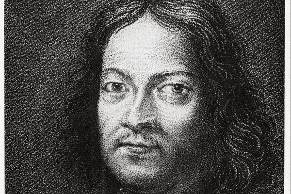
Pierre de Fermat, great French mathematician of the 17th century


Though I haven't exactly translated this style in the image below, I am still incorporating the technique to some degree. It is surprisingly difficult to accustom your hand to the neat flowing strokes and keeping the same width between them all the way!


Romanian gypsies

What really captured my attention was the beauty of motherly devotion and a touch of wild independence carried in their demeanor. This is why I am not entirely happy with my rendition - it doesn't quite capture their spirit. Here is the original:


I used a bit of charcoal for the pattern of her skirt, as well as shading the darker side of the wall, just to soften the stark pen lines.

A new technique - what can I say! Learning stroke by stroke...

Friday, 18 October 2013

Effervescence!

Do you know a sparkling character, with shining eyes and fiery spirit, delightful and fascinating as a kaleidoscope in its swirling colours? I know a sweet darling much like this, and upon finding a beautiful picture of her, I stowed it away for a quieter time when I might attempt capturing that lovely smile...


Little bridesmaid: The photo that inspired me


As you can see above, I began by using a grid, as is often done in portrait copying. This is a tremendous help in laying down your lines and proportions (providing both your grid and the one on the photo are identical!!) 


Another piece I'm busy with: example of the gridwork phase


I think I've learnt a lot simply through copying by eye, with the help of the grid to guide me. It definitely will improve one's unaided copying skills, and grasp of shapes from different perspectives.


As you can see, my grid must have been slightly stretched, as Bella's features are somewhat elongated in my rendition. A sure sign to be more precise with my grid copying!!


Monday, 7 October 2013

A beloved face...

About a month ago, equipped with my graphite pencil trio, an eraser and a ruler, I embarked on a sketching journey that unrolled before me in many miles of woven textile, as you will see below. (Or at least, so it felt.)


It was the first time I was beginning to capture my husband's facial to some degree of accuracy, and I was elated! 


Initial sketch
My husband found a mind-blowingly exhaustive website for art techniques, covering all topics from beginner's workspace and material recommendations, to mini courses on every classical drawing medium. You can find it here. He downloaded a PDF package which we have both been working through, and the material is undoubtedly very helpful. 

One of the tips I picked up from those notes, is sharpening your pencils on fine sandpaper or similar coarse surface. Apparently, and I can understand why, sharpeners wear down your pencils much too quickly. As I didn't have sandpaper, I hunted about for a stray brick, and found this grey one to be the perfect texture for working down my graphite tips to the desired shape. This is the other advantage of sanding over sharpening: you are able to fine-tune the exact shape and sharpness you are looking for.


Sharpening by sanding...

As Jonan my husband, loves textures, (especially when overlaid on photos and video animation!), I decided to draw in a woven textile in the background ("negative space", in fancy terms!). I looked up a nice strongly-defined fabric texture online, downloaded it, zoomed in very close and carefully studied the shadows and twists of each strand. Then I set about my long journey... It's been quite rewarding... But I must add, and most will understand, there is a certain point where your strongest desire is to see it finished!!


The final result: My wonderful, creative, kind-hearted husband!


So, at some point, I would like to be making beautiful life-like portraits, capturing those delightful special nuances of each character, just like Brenda Hoddinott...

Thursday, 3 October 2013

Sowing and harvesting

Something I'm very passionate about - coaxing tasty delights out of the earth, from the early days of putting a small seed just beneath the soil's surface, to that breath-taking moment of plucking off a succulent reward, and transforming a plain meal into something bright and flavoursome...

Some of my current veggie crops (I do realize the radish is oversized, but it's such a beautiful creation to me!)

In this piece I used my Superfine Faber Castell pen, combined with watercolour Inktense pencils. As you can see, I am experimenting how to make water droplets and shadows, which are somewhat tricky. Please give suggestions if you have any!

My first garden harvest! So proud of them!

Thursday, 19 September 2013

An imagined scene...

Sketching must be the most relaxing drawing style (for me, that is).

There seem to be three types of art subjects that I can think of right now: a) an art piece captured from a real life setting/image ; b) an imagined scene, yet true to real life ; and lastly c) a surreal imagined scene. Please comment with any other ideas you may have - I'd be very interested! I guess to that could also be added, d) graphic design art.

The below sketch is a type B art form. I made something from what I had in my mind, however unclear initially, and crystallized it on paper. At first, I couldn't exactly "see" it in my mind's eye, but I had a feel for what I wanted, and incorporated architecture and furniture that I have observed in the past and really liked. As this is all done from memory, there are bound to be technical errors in my designs, as these are purely from my perception of what I saw, without guidance of an image to correct what I thought I was seeing. 

I believe the keener an observer you become of the physical world, the more accurately you will draw and paint. Just take more note of what things actually look like, as you go about your day. I have so often been stumped, when I set myself to draw something from my mind's eye, and discovered I really did not know what it looked like! On the other hand, there are no doubt creative people who are able to conjure very detailed and specific creations in their minds, for conversion to art.


The Rapture


I combined many different snippets of elements I have picked up visually in the past - cracks in tiles, large tiles, old-fashioned windows, heavy wooden beams, pure cotton cloth, simple pitchers, fields of waving grasses... the list goes on. Things I really like!

Please comment if you have anything to contribute to these ramblings, I'd be delighted to hear...

Friday, 13 September 2013

Planted by the Rivers of Water

My first inspiration from Psalms...

The book of Psalms has been a close friend to me over the years, rich in nuggets of encouragement, personal emotional conflicts experienced by the great psalmist himself and how these matters tied in with his spiritual journey. In some way it deals with issues on  a very fine level and just unravels a knot in one's heart with a single breathtaking line or shared experience.

Planted by the Rivers
"He" (the man whose delight is in the law of the Lord) "shall be like a tree planted by the rivers of water, that brings forth his fruit in season, whose leaf also shall not wither; and whatsoever he does shall prosper." Ps. 1:3

As you can see, this man is bearing a variety of fruits in different parts of himself. Some of us specialize in one kind of fruit of the Lord. This is treasured just as much! I think even wanting to bear fruit is the beginning of having "life more abundantly".

I used my INKTENSE pencils (and water for blending) to create this image, first sketching the outlines in pencil, and then gradually building up the colour. I laid down very soft general washes or each colour region, ie. shades of green and yellow over the river banks, blue and indigo in the river (leaving lots of white areas), and of course various browns for the tree bark.

Once the first layer had dried, I detailed the leaves, fruit, grasses, exposed earth and water using the same pencils. I enjoyed experimenting with different colours to create shadows and nuances and even used some Fuschia in the tree trunk! And Peacock Blue in the shady grass... Sometimes such splashes help bring a picture more to life, just using an unexpected colour where most people would agree they are seeing, say, brown only.

More to follow soon...!

Thursday, 12 September 2013

Dots and crosses...

I have been thoroughly inspired by Albrecht Durer's works, after a friend mentioned his sketching style to me. What an engaging pen technique! I wanted to try my hand at it immediately after scanning through rows and rows of these masterpieces.

I know this particular artwork has been prolifically reproduced into countless forms since its creation, and might perhaps best be given a breather to simply be appreciated in its original loveliness. But what can I say - I fell into the same temptation of so many before me, eagerly reached for my Superfine Faber Castell and 4B Staedtler, and before I knew it, the lines were weaving together on my page... and yet another rendition of this work was born. All I can say is, it was a wonderful experience, and I was a little sad when I had to persuade myself it was actually done, any more might spoil it... 

A study of Albrecht Durer's "Praying Hands"
Superfine Faber Castell PITT Artist Pen on 120gsm sketch paper

Original by Durer - thank you Wikipedia!

Those hands really speak to me of the person they belong to - something tender and simple in his heart intermingled with the weathering and humility brought by hardship. Well-used hands too I would say, judging from the "milking muscle" next to his thumb! I'm sure he was a vegetable gardener too...

There are a few more artworks lined up for sharing, so have a peek again tomorrow!

Thursday, 5 September 2013

Dust in the dusk...

This is something I've wanted to try for a while - the great equine creatures fighting! I think these ones are prancing around each other, looking for the moment to attack...


Fire at Sunset - you could say the ground is aglow with their fury!

And very exciting news!!! My Derwent Art Academy pencils arrived in the post! You should have seen me, so ecstatic! These are gorgeous Inktense pens - specially designed for being blended with a wet or damp paintbrush. I shaded the above image with them.

Eighteen marvelous colours, with delicious names like "Thistle", "Bark" and "Baked Earth"...

Just this morning I had the idea to work through the book of Psalms, my most loved book, bringing its imagery to my pencil and paintbrush tips. I look forward to sharing this adventure with you...

This may take a while, as I am also engaged with illustrating my children's story book, Pobble in a Pickle. So far I have sketched the storyboard, as well as the first few images, which await the embellishment of watercolour!!

Ah, just the thought of those Inktense pencils make me happy!! Excuse me, I must go draw...

Monday, 2 September 2013

Rustling in the leaves...

Aren't watercolours just delightful?

I simply used a downloaded photo that I really liked and outlined the facial features and leaves in pencil. I actually took a bit of time on this stage, to be sure I was happy with the kitten's expression, as I kept coming up with an endless variety of naughty faces! The kitty in the photo actually looked a little scared and vulnerable - but that is the beauty of interpreting an image in your own way. Every person will produce something quite unique from anyone else, and which only that person can put onto paper.


Rustling in the leaves - watercolour acrylics


Saturday, 24 August 2013

Clippity-clop...

I've always loved drawing horses... When I was a little girl, my dad gave me a charming slender hard-cover booklet on "How to Draw Horses", somewhat worn from previous use, and softly pencilled in the inside cover with that trademark booksale price. I loved it so much, and pored over it endlessly, absorbing the energy of spirited horses in action caught in those wild graphite strokes all the way to those peaceful lines of the creature at rest... the intensity in its eye...the swish of its tail...the shaggy winter coat... And so you see, my pencil was much inspired by that book.


So far, the hoof has been the most challenging part for me - how the shape of the ankle merges into the foot and how to obtain the most pleasing proportions to the rest of the horse. Having a picture at hand is very helpful.

The below artwork was inspired by my husband, a little while ago when he suggested I try a horse on fire. He is unbelievably creative. So here it is - I first sketched it lightly, then blocked in the flames and finally the horse's body. The landscape evolved around the creature, as my own imagination took flight! So I dub it the Flaming River Horse, who is rarely glimpsed galloping down its river in this remote majestic canyon.

I used pastels chiefly, then used my pencils for finer details and also in the shading of the canyon walls. I intend to give this one another go on my large A2 sketchpad (got some better ideas for it!).


Flaming River Tashunke (Red Indian for "horse")

The other night Marius little daughters organized us mature adults for some drawing competitions (of which they would be the judge and the prize, a giant slab of chocolate). We had 20 minutes for each round, and I won't post my sketch here as I feel ashamed of it, but below is one I completed afterwards in my own time. This was the photo my husband and his contestant were given for the challenge, and I really felt like trying myself. It posed some real challenges because of its particular angle and the horse's funny expression. But I liked that face...


My tip for the week
Creating depth of field/perspective - By working in lots of fine detail and strong colours in the foreground, gradually fading to less detail and lighter application of colours in the background, will create the sense of greater distance. Also try to imitate the effect of a camera lens, crisp and in focus in front, fuzzy and undefined towards the back.

Happy doodling!

Tuesday, 20 August 2013

Skritchy scratchy...

And here we are - I've finished the last step of my Derwent Art Academy course! Step 6 was particularly fun, an exercise in pastel sgraffito... crazy enjoyable!


Starting off with some of your favourite colours, or colours you would like to have shining through in the end product, scribble two or three fairly solid layers, from light to dark. You can even have the shades of colour vary from one part of the page to another. Then finish off with a very dark colour ( I used black), being careful to press lightly so as not to disturb the layers underneath.


If you don't have a sgraffito embosser tool, use a toothpick!

To begin drawing, simply "scratch" out the outlines of your picture. Special tools are available for sgraffito, but a toothpick worked pretty well for me! These cats were taken from a photo of them sitting on a tiled floor. I preferred to have them sitting on a windowsill, so sketched in window panes and a sill instead. 

The finished product...

Below is an example of something quick if you'd like to try this technique with your pastels. Sgraffito is a great way to decorate home-made gift cards and very gratifying.


Glasses and jars seem to work very well for this style of drawing

Pastels are pretty awesome...

Let me know of your experiences in sgraffito, and of course feel most welcome to share any thoughts and comments!


Sunday, 18 August 2013

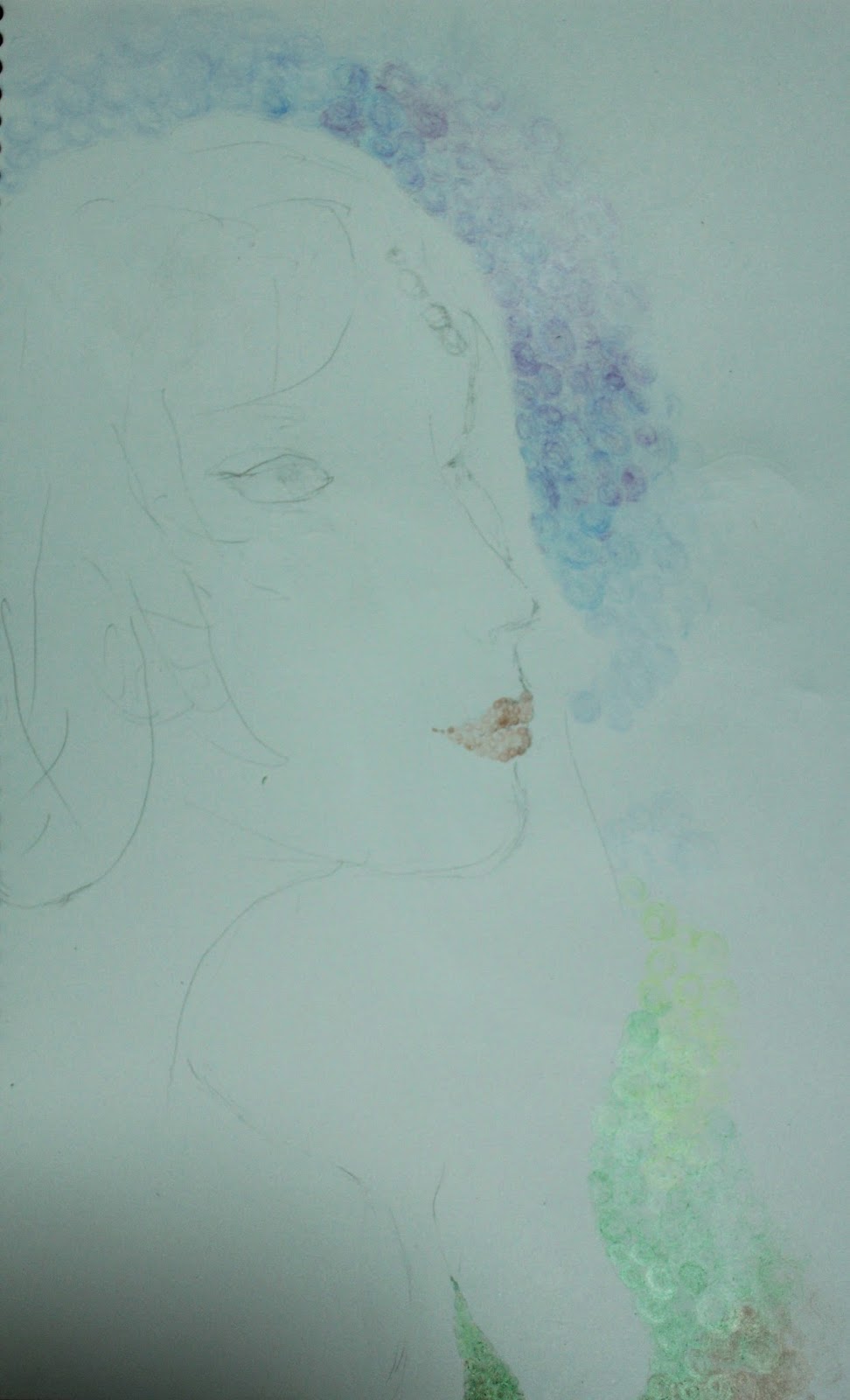
Working in circles...

Sometimes you get this wild feeling to try something out of the box, or an idea that just popped into your head. It wa a moment like this when I envisioned a picture composed entirely of solid circles!

It was very exciting I must say, getting to work, and every spare minute was fervently used to complete the drawing. I grabbed my sketch pencil and outlined the face and hair, then began colouring hundreds of dots from my twelve-colour pencil set. 


I loved the soft effect created from the gentle even pressure applied by the pencils, and how colour tones fade from one to another. I pressed a little harder for shadowy areas, and for lighter areas, used a combination of lightening the dots, as well as spacing them further apart. Some bright areas are virtually untouched. This is often what makes a picture stand out - contrast of shadow and light, and areas fading to nothing. A picture featuring little contrast will generally look a bit flat (very broadly speaking!).

There were many stages with this drawing, I felt I might destroy its delicate appearance, which caused me to hold back on stronger expression and defining the face better.

Let me know your thoughts on this piece, I'd love to hear!

Monday, 12 August 2013

Colour splashes and some more graphite...

I've really been enjoying a mini online course by Derwent Art Academy - it's free, only six simple steps, and at the end Derwent sends you a wooden box filled with 18 pencils of your choice! I was delighted to find their website (http://derwentacademy.co.uk/ ; go to the "Art Academy" section for the course), especially scrolling through myriads of sketches and colour art on their Art Prize website (http://www.derwent-artprize.com/gallery) You can also vote for your favourite three pieces!

Below is a recent cockerel study I finished as part of the course. To start off, I used very light pencil strokes in the general shape of the head, neck, body, legs and tail, just to lay down the correct slopes and proportions. Later, these lines may need to be erased in places, so they must be very light. I then used a light pencil, in the general colour of the cock, to outline details such as basal neck feathers, beak, eye, wing and tail feathers.

Then, colours!


The entire cock is composed of quick curved strokes of colour, some longer than other, to imitate the effect of many feathers lying together. I used a purple and dark blue to lay down the darker feathers, and then overlayed with black for the darkest shadows.


Eyes are tricky - I find every dot and stroke counts, so imagine something in your mind's eye (!) before detailing the eye. And usually less is more - just a dot, leaving a bit of white page for the twinkle, and a soft curve will do. Maybe a bit of soft background colour...

Cockerel sketched from a photo

The tail was surprisingly hard - just capturing that stunning sheen, while also incorporating the shapes and texture of tail feathers. Because the shine is so crisp, you need to create starker light and dark contrasts - blacks and purples surrounding whites and creams. You can circumvent this challenge though, using only long curved strokes of various colours for the tail, leaving white strips for the sheen. This will obviously create a different appearance, while still looking realistic.

London plane tree leaf
I've always loved the shape of the London Plane's leaf stalk, the way it comes to such an elegant end. If you are thinking of something to draw, I'd recommend trying something you really like - the shape of a guitar, the feeling of the wind high up in those pine trees, the sound of crunching gravel, the texture of leather... anything you've always just loved - if you draw it, the love for it will show.

And others will see what you are seeing!


Monday, 5 August 2013

Early steps in art...

You pick up that pencil, yet something intangible is holding the graphite tip back from the pristine sketch paper. Can you do it? Do you have the eye, the heart, the interpretation? Can you share something worthwhile, even inspiring?

Many potential artists face this obstacle, and and some simply avoid trying for the sake of protecting themselves from the experience of failure. But truth be told, we must all be willing to fail a little. The adventure is worth all that it holds, and growth, strength and patience begin to mold you further, as you persevere and love what you do.

As with many endeavours, improvement in art seems largely to be giving much time to it and producing a lot of work... learning and practicing new techniques, and figuring out how to improve your weaker drawing/painting areas. Don't get discouraged! It's an incredibly rewarding and even relaxing pursuit. Sometimes it's as simple a matter as discovering different ways to use your art mediums or just getting to know them better.

So I will be sharing with you my early steps in art... Today, three sketches...


Sketched from a real pine cone, using cross-hatching for shading
 I started with a very light outline sketch (called blocking in) of the cone's shape, and then blocked in each individual cone "stalk". Then I began shading, first straight lines for the lightest shadows, then crosshatching for the darker areas, and finally cross-crosshatching for the very darkest areas. I used the side of my softest pencil (6B) to shade in the shadow.

A study on light and shading on a sphere...
As you will see, the darkest area of the object is just above the bottom edge, leaving a bright strip curving along where object meets table. This is because light is reflecting off the table back onto the sphere's bottom rim. This is a good principle to remember for drawing any similar objects.


This was to capture the sweet spirit (though not physical appearance necessarily)
of my childhood pony

And a piece in pastel...

From a photo of mini pumpkin bread
rolls

I think investing in good art materials is key to enjoying your work and producing satisfying results. And keep learning - how was that effect achieved? How do you draw hair? (here's a great link: http://www.elfwood.com/farp/theart/maeryhair/maeryhair.html) How do you create the sensation of light and shadow? What colours were used to create that rippling effect?

Fascinating stuff!