Translate

Saturday, 24 August 2013

Clippity-clop...

I've always loved drawing horses... When I was a little girl, my dad gave me a charming slender hard-cover booklet on "How to Draw Horses", somewhat worn from previous use, and softly pencilled in the inside cover with that trademark booksale price. I loved it so much, and pored over it endlessly, absorbing the energy of spirited horses in action caught in those wild graphite strokes all the way to those peaceful lines of the creature at rest... the intensity in its eye...the swish of its tail...the shaggy winter coat... And so you see, my pencil was much inspired by that book.


So far, the hoof has been the most challenging part for me - how the shape of the ankle merges into the foot and how to obtain the most pleasing proportions to the rest of the horse. Having a picture at hand is very helpful.

The below artwork was inspired by my husband, a little while ago when he suggested I try a horse on fire. He is unbelievably creative. So here it is - I first sketched it lightly, then blocked in the flames and finally the horse's body. The landscape evolved around the creature, as my own imagination took flight! So I dub it the Flaming River Horse, who is rarely glimpsed galloping down its river in this remote majestic canyon.

I used pastels chiefly, then used my pencils for finer details and also in the shading of the canyon walls. I intend to give this one another go on my large A2 sketchpad (got some better ideas for it!).


Flaming River Tashunke (Red Indian for "horse")

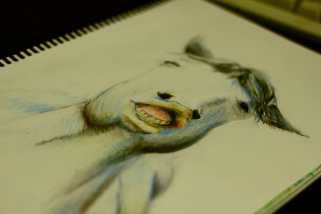
The other night Marius little daughters organized us mature adults for some drawing competitions (of which they would be the judge and the prize, a giant slab of chocolate). We had 20 minutes for each round, and I won't post my sketch here as I feel ashamed of it, but below is one I completed afterwards in my own time. This was the photo my husband and his contestant were given for the challenge, and I really felt like trying myself. It posed some real challenges because of its particular angle and the horse's funny expression. But I liked that face...


My tip for the week
Creating depth of field/perspective - By working in lots of fine detail and strong colours in the foreground, gradually fading to less detail and lighter application of colours in the background, will create the sense of greater distance. Also try to imitate the effect of a camera lens, crisp and in focus in front, fuzzy and undefined towards the back.

Happy doodling!
Tuesday, 20 August 2013

Skritchy scratchy...

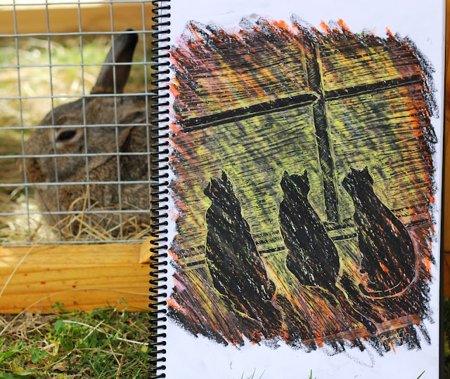
And here we are - I've finished the last step of my Derwent Art Academy course! Step 6 was particularly fun, an exercise in pastel sgraffito... crazy enjoyable!


Starting off with some of your favourite colours, or colours you would like to have shining through in the end product, scribble two or three fairly solid layers, from light to dark. You can even have the shades of colour vary from one part of the page to another. Then finish off with a very dark colour ( I used black), being careful to press lightly so as not to disturb the layers underneath.


If you don't have a sgraffito embosser tool, use a toothpick!

To begin drawing, simply "scratch" out the outlines of your picture. Special tools are available for sgraffito, but a toothpick worked pretty well for me! These cats were taken from a photo of them sitting on a tiled floor. I preferred to have them sitting on a windowsill, so sketched in window panes and a sill instead. 

The finished product...

Below is an example of something quick if you'd like to try this technique with your pastels. Sgraffito is a great way to decorate home-made gift cards and very gratifying.


Glasses and jars seem to work very well for this style of drawing

Pastels are pretty awesome...

Let me know of your experiences in sgraffito, and of course feel most welcome to share any thoughts and comments!


Sunday, 18 August 2013

Working in circles...

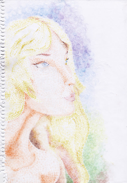
Sometimes you get this wild feeling to try something out of the box, or an idea that just popped into your head. It wa a moment like this when I envisioned a picture composed entirely of solid circles!

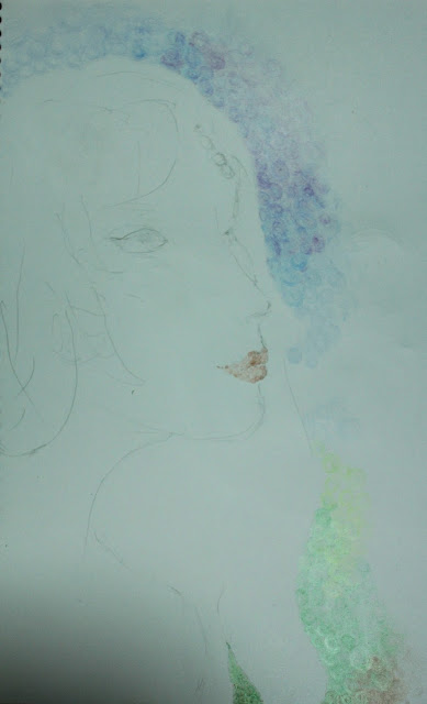
It was very exciting I must say, getting to work, and every spare minute was fervently used to complete the drawing. I grabbed my sketch pencil and outlined the face and hair, then began colouring hundreds of dots from my twelve-colour pencil set. 


I loved the soft effect created from the gentle even pressure applied by the pencils, and how colour tones fade from one to another. I pressed a little harder for shadowy areas, and for lighter areas, used a combination of lightening the dots, as well as spacing them further apart. Some bright areas are virtually untouched. This is often what makes a picture stand out - contrast of shadow and light, and areas fading to nothing. A picture featuring little contrast will generally look a bit flat (very broadly speaking!).

There were many stages with this drawing, I felt I might destroy its delicate appearance, which caused me to hold back on stronger expression and defining the face better.

Let me know your thoughts on this piece, I'd love to hear!

Monday, 12 August 2013

Colour splashes and some more graphite...

I've really been enjoying a mini online course by Derwent Art Academy - it's free, only six simple steps, and at the end Derwent sends you a wooden box filled with 18 pencils of your choice! I was delighted to find their website (http://derwentacademy.co.uk/ ; go to the "Art Academy" section for the course), especially scrolling through myriads of sketches and colour art on their Art Prize website (http://www.derwent-artprize.com/gallery) You can also vote for your favourite three pieces!

Below is a recent cockerel study I finished as part of the course. To start off, I used very light pencil strokes in the general shape of the head, neck, body, legs and tail, just to lay down the correct slopes and proportions. Later, these lines may need to be erased in places, so they must be very light. I then used a light pencil, in the general colour of the cock, to outline details such as basal neck feathers, beak, eye, wing and tail feathers.

Then, colours!


The entire cock is composed of quick curved strokes of colour, some longer than other, to imitate the effect of many feathers lying together. I used a purple and dark blue to lay down the darker feathers, and then overlayed with black for the darkest shadows.


Eyes are tricky - I find every dot and stroke counts, so imagine something in your mind's eye (!) before detailing the eye. And usually less is more - just a dot, leaving a bit of white page for the twinkle, and a soft curve will do. Maybe a bit of soft background colour...

Cockerel sketched from a photo

The tail was surprisingly hard - just capturing that stunning sheen, while also incorporating the shapes and texture of tail feathers. Because the shine is so crisp, you need to create starker light and dark contrasts - blacks and purples surrounding whites and creams. You can circumvent this challenge though, using only long curved strokes of various colours for the tail, leaving white strips for the sheen. This will obviously create a different appearance, while still looking realistic.

London plane tree leaf
I've always loved the shape of the London Plane's leaf stalk, the way it comes to such an elegant end. If you are thinking of something to draw, I'd recommend trying something you really like - the shape of a guitar, the feeling of the wind high up in those pine trees, the sound of crunching gravel, the texture of leather... anything you've always just loved - if you draw it, the love for it will show.

And others will see what you are seeing!


Monday, 5 August 2013

Early steps in art...

You pick up that pencil, yet something intangible is holding the graphite tip back from the pristine sketch paper. Can you do it? Do you have the eye, the heart, the interpretation? Can you share something worthwhile, even inspiring?

Many potential artists face this obstacle, and and some simply avoid trying for the sake of protecting themselves from the experience of failure. But truth be told, we must all be willing to fail a little. The adventure is worth all that it holds, and growth, strength and patience begin to mold you further, as you persevere and love what you do.

As with many endeavours, improvement in art seems largely to be giving much time to it and producing a lot of work... learning and practicing new techniques, and figuring out how to improve your weaker drawing/painting areas. Don't get discouraged! It's an incredibly rewarding and even relaxing pursuit. Sometimes it's as simple a matter as discovering different ways to use your art mediums or just getting to know them better.

So I will be sharing with you my early steps in art... Today, three sketches...


Sketched from a real pine cone, using cross-hatching for shading
 I started with a very light outline sketch (called blocking in) of the cone's shape, and then blocked in each individual cone "stalk". Then I began shading, first straight lines for the lightest shadows, then crosshatching for the darker areas, and finally cross-crosshatching for the very darkest areas. I used the side of my softest pencil (6B) to shade in the shadow.

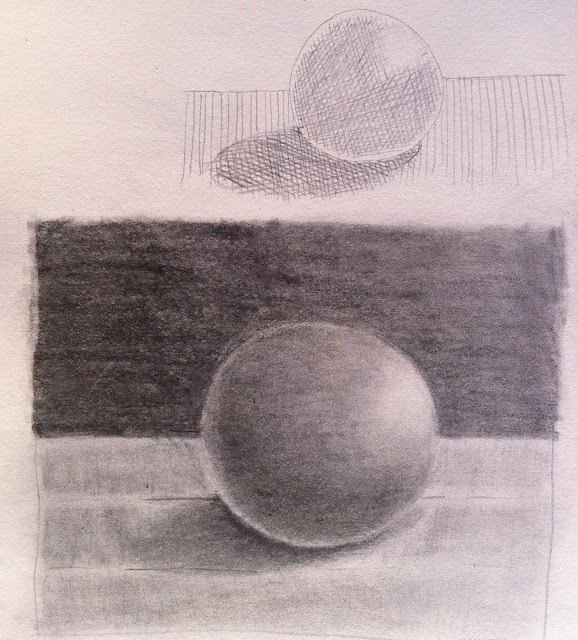
A study on light and shading on a sphere...
As you will see, the darkest area of the object is just above the bottom edge, leaving a bright strip curving along where object meets table. This is because light is reflecting off the table back onto the sphere's bottom rim. This is a good principle to remember for drawing any similar objects.


This was to capture the sweet spirit (though not physical appearance necessarily)
of my childhood pony

And a piece in pastel...

From a photo of mini pumpkin bread
rolls

I think investing in good art materials is key to enjoying your work and producing satisfying results. And keep learning - how was that effect achieved? How do you draw hair? (here's a great link: http://www.elfwood.com/farp/theart/maeryhair/maeryhair.html) How do you create the sensation of light and shadow? What colours were used to create that rippling effect?

Fascinating stuff!